How to Create Custom, Horizontal, and Vertical Error Bars in Excel
There may be instances where a data point’s level of variability is present when data is shown in a chart.
For instance, it is impossible to forecast the temperature for the upcoming 10 days or a firm’s stock price for the upcoming week (100 percent of the time).
The data will always be subject to some degree of fluctuation. The ultimate value can be somewhat higher or slightly lower.
Use Excel’s Error Bars in the Charts if you need to depict this type of data.
This instruction explains:
1. How do error bars work?
2. Error Bars in Excel Charts: How to Add Them
3. Excel charts' various error bars
4. Custom Error Bars in Excel Charts: Adding
5. Changing the Error Bars' Format
6. Excel Charts: Adding Horizontal Error Bars
7. Including Error Bars in a Combo Chart for a Series
8. removal of the error bars
1. How do error bars work?
In an Excel chart, error bars are the bars that would depict a data point’s fluctuation.
You can determine how accurate the data point is by doing so (measurement). It explains how much the real can differ from the stated value (higher or lower).
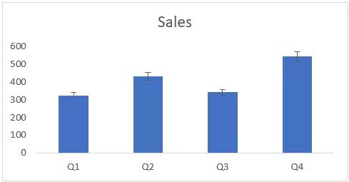
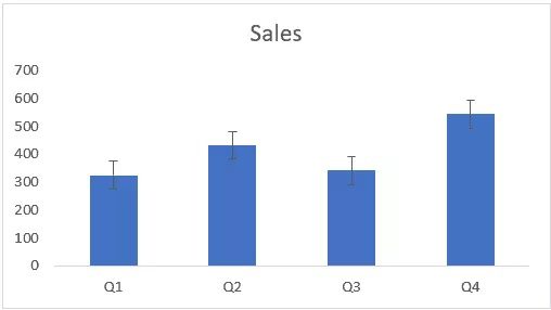
For instance, there is an error bar for each of the quarter bars in the chart below, which shows my sales projections for the four quarters. Each error bar shows how much the sales for each quarter might decrease or increase.
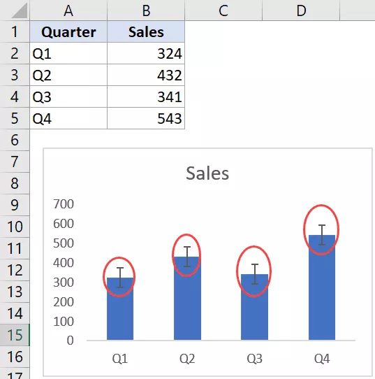
The accuracy of the data point in the chart decreases with increasing variability.
I hope this provides you with a general understanding of error bars and how to utilize them in Excel charts. Let me now demonstrate how to include these error bars in Excel charts.
2. Excel Chart Error Bars: Adding Them
A 2-D line, bar, column, or area chart in Excel can have error bars added to it. It can also be included in a bubble chart or an XY scatter chart.
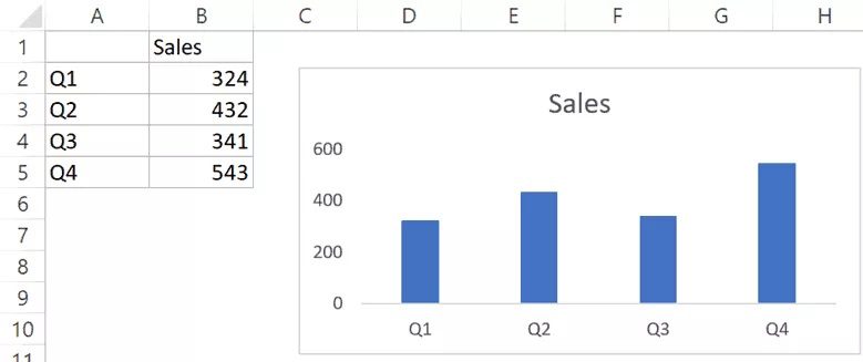
Let’s say you have the dataset and the chart below that were both made using it, and you want to add error bars to this dataset:

The steps to add data bars in Excel (2019/2016/2013) are as follows:
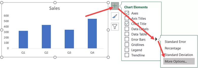
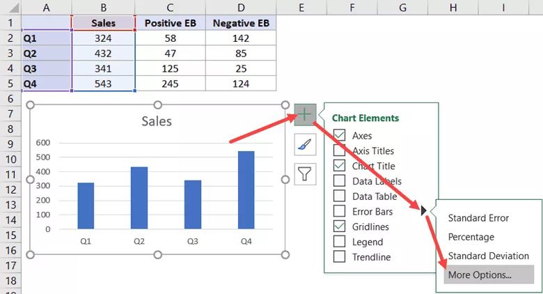
- Anywhere in your chart may be clicked. It will make the three icons as seen below accessible.
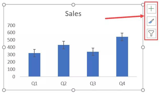 Choose the + sign (the Chart Element icon)
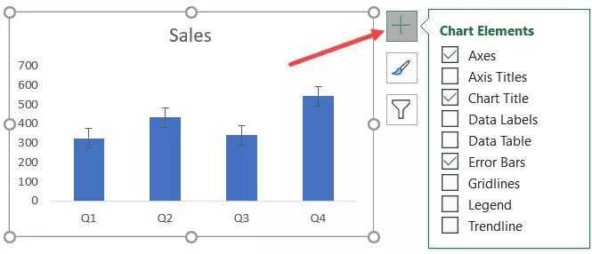
- Click on the black triangle icon that appears when you hover the mouse over the “Error Bars” option to the right.
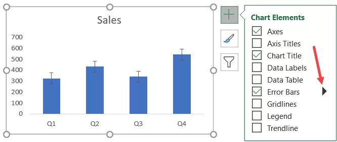
- Select from the available options (Standard Error, Percentage, or Standard Deviation), or click ‘More Alternatives’ to see further options. Here, I am selecting the Percentage option.
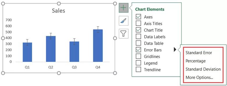
The percentage error bar would be added to all four columns in the chart by following the procedures above.
The percentage error bar’s default value is 5%. Accordingly, it will provide an error bar that is just 5% above or below the current value.
3. Excel charts’ several types of error bars
As you can see from the steps above, Excel offers a variety of error bars.
So let’s examine each of these individually (and more on these later as well).
Error Bar with ‘Standard Error’
This displays each value’s “standard error of the mean.” This error bar indicates how far out from the actual population mean the data’s mean is most likely to be.
You could require this if you work with statistical data.
Error Bar for “Percentage”
This is an easy one. Each data point will display the given percentage variation.
For instance, we added percentage error bars to the figure above where the percentage number was 5%. Accordingly, the error bar will range from 95 to 105 if your data point value is 100.
Error Bar with ‘Standard Deviation’
This demonstrates how closely the bar resembles the dataset’s mean.
In this instance, the error bars are all in the same location (as shown below). You may also view the variance from the dataset’s overall mean for each column.
Excel displays these error bars with a standard deviation value of 1 by default, but you may adjust this if you’d like (by going to the More Options and then changing the value in the pane that opens).
Error Bar with a “Fixed Value”
As the name implies, this displays error bars in situations where the error margin is fixed.
For instance, you may configure the error bars to be 100 units in the quarterly sales example. It will then provide an error bar with a range of possible values of -100 to +100 units (as shown below).
Error Bar, “Custom”
You may use the custom error bars option to construct your custom error bars by defining the upper and lower bounds for each data point.
You can maintain the same range for all error bars or create unique custom error bars for each data point (example covered later in this tutorial).
This could be helpful when each data point has a distinct amount of variability. For instance, I may have minimal variability and be extremely confident in Q1’s sales figures, but less so in Q3 and Q4 (i.e., high variability). In these circumstances, I may utilize personalized error bars to highlight the unique variability in each data point.
Let’s look at adding custom error bars to Excel charts in more detail now.
4. Adding Custom Error Bars in Excel Charts
Besides bespoke error bars, the application of fixed, percentage, standard deviation, and standard error bars is relatively simple. All you have to do is choose the option and enter a value (if needed).
More work has to be done on custom error bars.
With bespoke error bars, there are two possible outcomes:
- The variability is the same for all data points.
- Each data point varies independently.
Check out the Excel instructions for each of them.
5. Changing the Error Bars’ Format – All Data Points Have the Same Variability
Let’s say you have the data set depicted below and a graphic that goes along with it.
The procedures for making unique error bars, where each data point’s error value is the same, are listed below:
- Anywhere in your chart may be clicked. It will make the three chart choice icons visible.
- choose the + sign (the Chart Element icon)
- Right-click the black triangle symbol next to the “Error bars” option.
- Select “More Options”
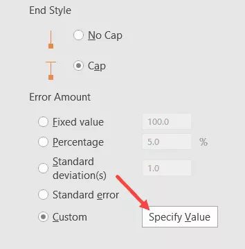
- Check Custom in the “Format Error Bars” window.
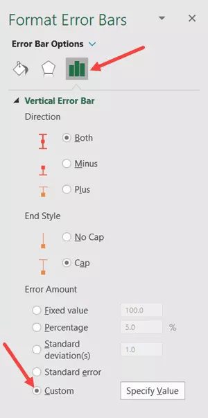
- To provide a value, click the button.

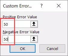
- Enter the positive and negative error values in the resulting Custom Error dialogue box. You can manually input the value instead of deleting the one already present in the field (without any equal to sign or brackets). I’m using 50 as the error bar value in this case.
- OK
In the column chart, this would result in identical custom error bars being applied to each column.
6. Excel Charts: Adding Horizontal Error Bars
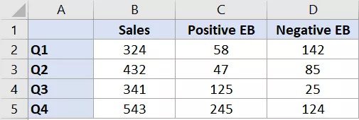
If you want distinct error values for each data point, you must save these values in an Excel range before you can use that range as a reference.
For instance, let’s say I want the error bars to be drawn after manually calculating the positive and negative error values for each data point (as seen below).
The procedures are as follows:
Use the sales information to create a column chart.
- Anywhere in your chart may be clicked. It will make the three icons as seen below accessible.
- choose the + sign (the Chart Element icon)
- Right-click the black triangle symbol next to the “Error bars” option.
- Select “More Options”
- Check Custom in the “Format Error Bars” window.
- To provide a value, click the button.
- Select the range with these numbers by clicking on the range selector icon for the Positive Error Value in the Custom Error dialogue box that appears (C2:C5 in this example)
- Select the range that contains these numbers by first clicking on the range selection icon for the negative error value (D2:D5 in this example)
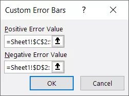
- OK
Based on the chosen values, the aforementioned processes would provide you with unique error bars for each data point.
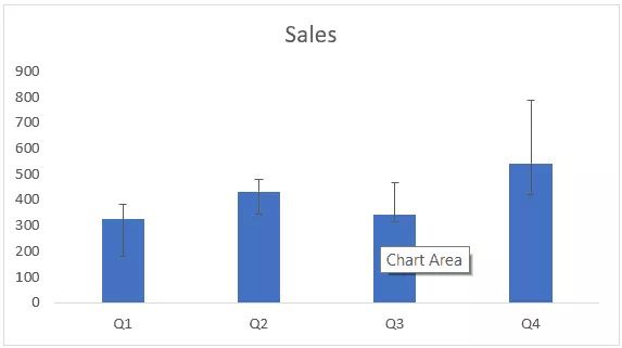
Because the values in the “Positive EB” and “Negative EB” columns in the dataset were used to specify these error bars, it should be noted that each column in the above chart has a different size error bar.
The graphic would automatically update if you changed any of the settings afterward.
Changing the Error Bars’ Format
You may format and change the error bars in a few different ways. These consist of the bar’s color, thickness, and form.
Right-click on any of the bars and select “Create Error bars” to format an error bar. The “Format Error Bars” window will then open on the right.
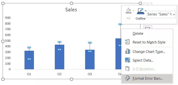
What you may format or change in an error bar is shown below:
Size and color of the error bar
To accomplish this, choose the “Fill and Line” option, then alter the width and/or color.
If you want your error bar to differ from a solid line, you may also modify the type of dash.
This might be helpful, for instance, if you want to emphasize the error bars rather than the data points. In that instance, you may make the error bars stand out by making everything else light in color.
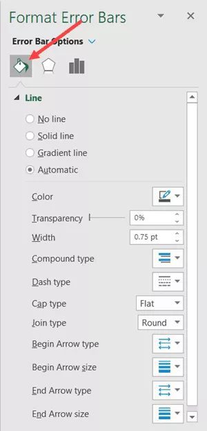
Orientation and design of the error bar
You may decide whether to merely display the plus or minus error bars or to display error bars that span both the positive and negative sides of the data point.
From the Direction option in the “Format Error Bars” window, these options can be modified.
You may also decide whether or not the end of the bar should have a cap. The chart on the left in the example below has the cap, whereas the chart on the right does not.
6. Excel Charts: Adding Horizontal Error Bars
The vertical error bars have been seen thus far. which chart types are most frequently used in Excel? (and can be used with column charts, line charts, area charts, and scatter charts)
However, horizontal error bars can also be included and used. Both the scatter charts and bar charts may be utilized with these.
Here is an illustration of a bar chart I created using the quarterly data.
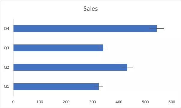
Similar to how we added vertical error bars in the sections above, we can create horizontal error bars using the same technique.
To scatter charts or bubble charts, you may also include horizontal (as well as vertical) error bars. In the example below, I have added both vertical and horizontal error bars to the scatter chart where I have plotted the sales and profit figures.
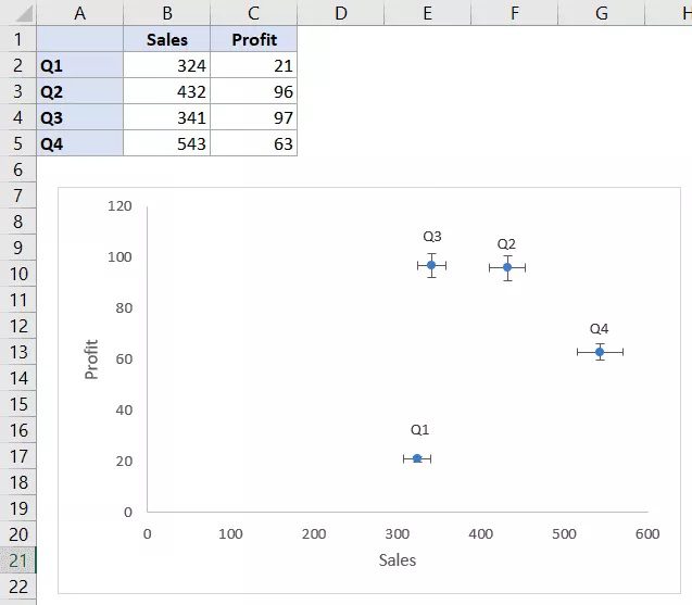
These error bars (vertical or horizontal) can also be formatted independently. For instance, you could wish to display bespoke error bars for vertical error bars and a % error bar for horizontal error bars.
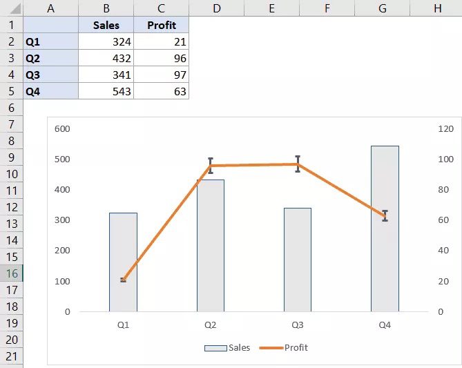
7. Including Error Bars in a Combo Chart for a Series
You may add error bars to any one of the series when using combination charts.
Here is an illustration of a combination chart where I have plotted the profit as a line chart and the sales figures as columns. And the line chart now includes an error bar.
The actions to add error bars to a certain series alone are listed below:
- Decide the series you wish to add error bars to.
- choose the + sign (the Chart Element icon)
- Right-click the black triangle symbol next to the “Error bars” option.
- Select the error bar you wish to include.
All of the series in the chart can have error bars added if you like. Repeat the process, remembering to choose the series you wish to add the error bar to in the first step.
Note: It is not possible to add an error bar to only one particular data point. It is added to all the data points in the chart for that series when you add it to a series.
Removal of the error bars
- It’s really easy to remove the error bars.
- To eliminate an error bar, simply select it and press the delete key.
- All of the error bars for that series will be deleted when you do this.
- You can opt to remove just one of these error bars if you have both horizontal and vertical error bars (again by simply selecting and hitting the Delete key).
- So that’s all there is to learning how to create error bars in Excel.

Pingback: roulette online